Thinking & coding: Constants group and Theme customizing
From last session to edit.
Most I have found myself making the app heavier than necessary, I guess? I have used Padding widgets around the Text widgets. I better use a Container widget, it also has a padding constructor. Or does this actually make no difference, i wonder? How can I find out about this. I've looked in the DevTool for that. But I got the answer from Max Weber of Flutter Explaned. Basically it comes down to the same thing, but the container widget offers more possibilities. So I replace all the Padding () with Container ().
My custom font from the prototype.
In this session today the implementation of a FontFamily. I want the font from the prototype. That's 'Oxygen' in the design. What do I have to look out for that is fontweight and fontsize. I can easily deduce this from the inspector in Figma.
I went to Googlefonts.com to download this font family and copy & paste it into a new assets folder fonts.
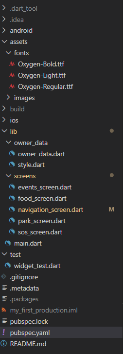
We have to import the Font family and describe it in Pubspec.yaml.
1 2 3 4 5 6 7 8 9 10 11 12 13 14 15 16 17 18 19 20 21 22 23 24 25 26 27 28 29 30 31 | flutter: # The following line ensures that the Material Icons font is # included with your application, so that you can use the icons in # the material Icons class. uses-material-design: true # To add assets to your application, add an assets section, like this: assets: - assets/images/ # An image asset can refer to one or more resolution-specific "variants", see # https://flutter.dev/assets-and-images/#resolution-aware. # For details regarding adding assets from package dependencies, see # https://flutter.dev/assets-and-images/#from-packages # To add custom fonts to your application, add a fonts section here, # in this "flutter" section. Each entry in this list should have a # "family" key with the font family name, and a "fonts" key with a # list giving the asset and other descriptors for the font. For # example: fonts: - family: Oxygen fonts: - asset: assets/fonts/Oxygen-Regular.ttf weight: 300 - asset: assets/fonts/Oxygen-Light.ttf weight: 100 - asset: assets/fonts/Oxygen-Bold.ttf weight: 600 |
Then I created a folder style.dart to include my own theme.
1 2 3 4 5 6 7 8 9 10 11 12 13 14 15 16 17 18 19 20 21 22 23 24 25 26 27 28 29 30 31 32 33 34 35 36 37 38 39 40 41 42 43 44 45 46 47 48 49 | import 'package:flutter/material.dart'; import 'package:my_first_production/owner_data/owner_data.dart'; const Headline1TextSize = 48.0; const SubTitle1TextSize = 36.0; const SubTitle2TextSize = 24.0; const BodyTextSize = 18.0; const String fontNameDefault = 'Oxygen'; const Headline1TextStyle = TextStyle( fontFamily: fontNameDefault, fontWeight: FontWeight.w600, fontSize: Headline1TextSize, color: colorPalletDarkButAndText, shadows: [ Shadow( blurRadius: 10.0, color: Colors.grey, offset: Offset(-4.0, -4.0), ), ], ); const SubTitle1TextStyle = TextStyle( fontFamily: fontNameDefault, fontWeight: FontWeight.w300, fontSize: SubTitle1TextSize, color: colorPalletDarkButAndText, shadows: [ Shadow( blurRadius: 10.0, color: Colors.grey, offset: Offset(-4.0, -4.0), ), ], ); const SubTitle2TextStyle = TextStyle( fontFamily: fontNameDefault, fontWeight: FontWeight.w300, fontSize: SubTitle2TextSize, color: colorPalletDarkButAndText); const BodyText1TextStyle = TextStyle( fontFamily: fontNameDefault, fontWeight: FontWeight.w600, fontSize: BodyTextSize, color: colorPalletDarkButAndText); |
I implemented my Theme in to Main.dart
1 2 3 4 5 6 7 8 9 10 11 12 13 14 15 16 17 18 19 20 21 22 23 | void main() { runApp(MyApp()); } class MyApp extends StatelessWidget { // This widget is the root of my application. @override Widget build(BuildContext context) { return MaterialApp( home: HomeScreen(), theme: ThemeData( textTheme: TextTheme( headline1: Headline1TextStyle, subtitle1: SubTitle1TextStyle, subtitle2: SubTitle2TextStyle, bodyText1: BodyText1TextStyle, ), ), ///is the landingspage where all navigation happens. Inside this screen is the Naviagtion screen. ); } } |
As you can see, I also found the propertie shadow within the theme. Nice!
If I now place both screens next to each other, you see that the coded screen in Flutter is almost identical to the screen design in Figma. I am almost there.

In the next session I will try to have more space between the icons verticaly. And I have to implement the NavigationRail Theme. To adjust the properties of the icons on pressed.
Please take some time to leave your comments on this post.
Do, believe and be happy
Stefaan

Bedankt aan Max Weber en Nick Manning.

Hi Stefaan,
ReplyDeletegreat Post and your app takes already quite good shape, I love that :).
One idea to think about at the first sentence you wrote that you want to replace all your Padding widgets with Containers because you have "more" capabilities. Usually in development you try to only allow what is absolutly necassery. In this instance if you only want a padding, you would allow more capabilities even if you not need them.
Keep it simple, if you just need a padding use the Padding widget :)
Thank you Max! I'm glad you like my progress. And another good lesson learned to keep it simple. I will do. I will keep you up to date. There are a few hard coding steps coming my way in the near future, in my project. Listview.builder generating a listview with data from the backhand. Two new things. it will be an adventure.
DeleteThanks for your time!