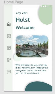
My navigation choice and landing page.
choice of navigation
Now that the colors and background are fixed, I have made a choice of navigation. My analysis showed that all information had to be accessible via all screens and very clear. I then opted for a vertical navigation column on the left side of the screen. With Flutter in mind I am talking about a "Navigation Rail". I also find it very pleasant to work with this principle. After asking friends and acquaintances, they thought this choice was quite good in this case.
an anomaly in our field of vision
From my analysis it follows that I need 5 screens. You can find the analysis here. So in the navigation bar 5 icons. I choose simple icons that fit in with my creative idea. The icons come from the Figma plug-in "icon8" and are square to all other round shapes in the project. this again provides a graphical separation between page and navigation. As a result, when opening the landing page, sooner or later the attention has to go to the icons, because they form an anomaly in our field of vision
play with opacity
The background color of the navigation bar should come from my color palette, but of course I can always play with opacity of this layer and the icons.
This is the result.


Comments
Post a Comment